

Dyno graph: How to read a car dyno graph
What does a dyno test tell you? What do the lines on the Dyno graph mean? Want to know How to Read a Car Dyno Graph?
Stock data:550bhp & 680 NM Torque
With mechanical modifications: +100BHP & +280 NM Torque
NOW THIS VEHICLE IS PULLING A MASSIVE 650BHP & 960NM TORQUE
The lines on the graph show an overlay of two dyno runs on the vehicle. The BLUE line representing the horsepower output and the RED representing the torque output.
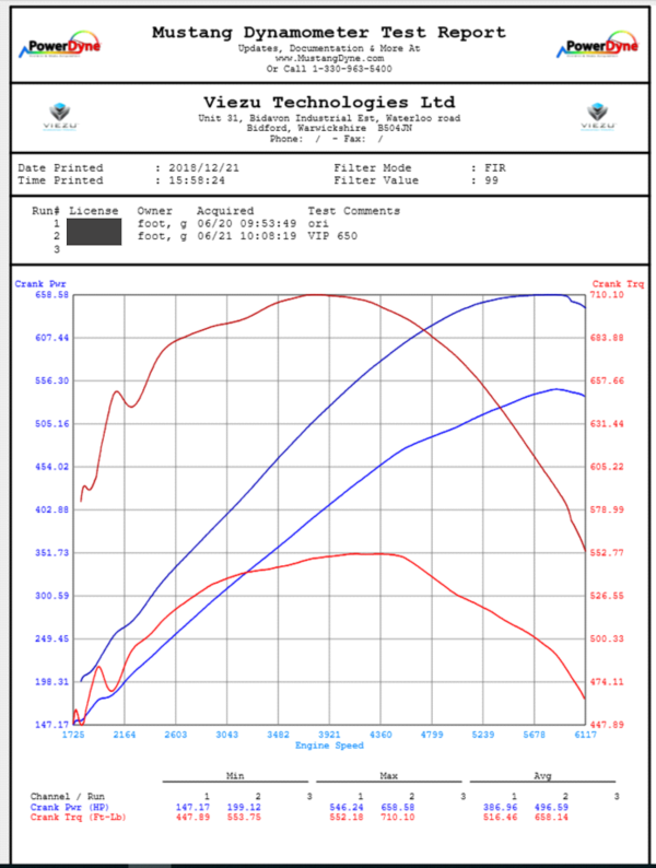
The torque is measured in foot lbs and the engine power output is measured in horsepower. The lower pair of red and blue lines are the original runs and the higher pair of red and blue lines represent the tuned run.
The axis on the left is for the HP and the axis on the right is for the torque with the X-axis at the bottom showing the engine RPM.
Underneath the graph is 3 sets of data figures: MIN / MAX / AVG. The MAX and the AVG are the important figures as they show you the peak gain and the overall average gain across the rpm band. The MIN simply shows the lowest point where the test started. 🙂
Find out more about our performance tuning service